Good Enough RAW Processing

Interesting:

Software Week Recap
Let’s get the dirty work out of the way right up front: I no longer recommend Capture NX2 as the best NEF raw file converter

These days I capture images of three types:
Nikon RAW files from the D300
Sigma RAW files from the DP1
JPEG files from various sources (processing lab scans, iPhone, etc)

I continue to use Aperture as my image database. Its fast and integrates well into my Apple product ecosystem.

The one drawback is that Apple doesn’t support the Foveon RAW files, so they need to be converted in the Sigma program in bulk before being brought into Aperture. Then if I want to tweak the RAW conversion, I need to find the RAW file which is not managed in Aperture and create a new version. However with the great exposure control of the DP1 and its exposure latitude, that’s been very rare. Once or twice, I’ve done spit RAW conversions, where I create a version for highlights and one for shadows to merge both in Photoshop.

Thom’s assertion that Aperture’s conversion was now the equal of Capture NX2 certainly suggested that I should take a second look at the quality of what Aperture does, since I could potentially drop a step to directly move the file to Photoshop for editing.

Its always interesting to contemplate how to make these comparisons, since the conversion is only a starting point. An apparent relative defect in conversion, like flat rendition, could become an asset for later editing stages. So logically, one should take an image down each of the paths independently, all the way to print or web display, and compare.

Sigma DP2 Soon?

Dumpster Detail 0-21

I remain absolutely floored by the Nik Tonal Contrast filter. It actually takes much of the flatness of digital away, creating what looks to me like more film like local contrast.

I’ve been shooting pretty exclusively with the Nikon D300 and Tamron f2.8 midrange zoom combination. The DP1 sits on the shelf, waiting. As long as carrying the Nikon is no problem, I have no real reason to go to the less flexible DP1. I guess its waiting for a travel opportunity.

I’ve thought a bit about whether or not I would jump to the DP2 once it arrives. The DP1’s two great limitations are shot to shot speed and the f/4 lens. The DP2 promises to improve both with new electronics and a faster, slightly less wide lens.

Carl Rytterfalk has the first hands on field review of a preproduction model.

Initial DP2 review with full size shots.. | Carl Rytterfalk Fotografi: ” Faster operation! Now very useful in studio as shot to shot is much improved! “

His take is very encouraging. Great lens as expected. And that beautiful foveon tonality and color rendering.

Nik Tonal Contrast

Pile of Sticks, originally uploaded by jjvornov.

Thanks to Moose Peterson for finally revealing what his latest Nik secret filter is. It’s tonal contrast. Here’s his video on the technique. As he notes, it’s really very much like an HDR filter because it’s a local contrast booster. You’ll see in his video how easy it is to get carried away with this thing. However there’s something that he alludes to that I think is really valuable. He demonstrates how one can crank it up and apply multiple times. Well the overall effect is not believable at all. But it’s easy enough to selectively paint in some of this extra effect to create what Vincent Versace called a belivable improbability.

He’s been told the technique is cheating. I’m with Moose on this. I’m lazy to the core. I’m looking for the fastest way to convey what I see in these mundane suburban views.

One of the other features in this image is fill flash. I liked the accentuation of the shadow depth and plan to explore the effect a bit more.

Thanks to 10001 Noisy Cameras

Blocked and Boarded

My thanks to 1001 Noisy Cameras for again featuring my Flickr photography as part of their flickr member showcase They’re the best photo news aggregator that I know of and provide a nice hub for keeping up on the latest gear rumors and reviews.

I for one have too many good cameras for now. The Sigma DP1 really provides me with an almost effortless experience as long as I can slow myself down to its speed of capture. I had a nice groove last week in Cambridge and came home with a small number of images that fit together nicely.

Extremes


Trunk Detail, originally uploaded by jjvornov.

This image was pushed very hard in post processing The right side of the image was in poor focus compared to the center/left. I assume it was mostly due to the angle that I captured it at and a wide aperture.

Instead of throwing it out, I took the image way down with what Vincent Versace calls a dark to light curve- a heavily convex curve that pulls the values down. I then selectively lowered the effect on the sharp portions of the image, illuminating the areas I wanted the view to see. If you look, the out of focus areas are still there, but they are not where one looks first.

It’s not a great image, but I like the idea of painting with light well enough to create one that is at least passable and reads as a believable reality.

Taking It On the Road


Canal, originally uploaded by jjvornov.

Because of traffic, I decided to take the long way round to suburban NJ. Interstate 78 goes past Bethlehem, PA. We had stopped in Bethlehem on a vacation trip, actually looking for coffee after a night’s camping in the Lehigh Valley.

The city is spit down the middle by the river. On the south side are the old steel mills, where there’s an interesting mix of hilly old, small housing and the old steel mils. There seems to be condo development along the river in some of the old industrial sites.

On the other side of the river is the upscale, historic side of the city. This image is from that side of town.

Another Camera Bag

While in the camera store this afternoon, I also bought a new camera bag. It’s the fourth bag that I’ve ever purchased. The first goes back to my Minolta SRT-201 days, a little Sundog that was great for a small film camera and an extra prime. I think that I may have put the Olympus E-1 in it from time to time, but the E-1 basically just had the really nice Zuiko 14-54mm f/2.8-3.5 on it all the time (28-108 equivalent). I’ve bought two camera bags since, but neither has seen real service. I picked up a Mountainsmith waistpack on sale at Campmoor in NJ once, but it seemed to be all padding and too small inside for it’s bulk. I took it out once or twice, but it mostly moved from car to house holding two lenses and a flash. I moved up in size with a bigger Kata bag, but it was just a bigger waste. I held my full nikon kit, but again just seemed too bulky to be useful as anything other than a way to transport kit from one site to another.

I have a little collection of Domke wraps that cushion equipment enough to put it into whatever I’m carrying for travel- laptop backpack, currently a nice Patagonia Lightwire or hiking pack. My philosophy has been that the camera should either be out and being used or put away.

One of the problems is that these packs are all too big for daily use. I have a small list of items that pretty much go everywhere with me:
1. iPhone
2. Small notebook
3. Fountain Pen
4. Camera.

I can fit 1, 2 and 3 into pockets. I the winter, the DP1 can go into a jacket or coat pocket, but not at other times. No way to bring the Nikon DSLR other than hand carried. Which I can do if there’s just one lens, sitting on the camera.

I’ve looked for a small simple messenger style bag over the years for a DSLR plus one lens. This Lowepro Terraclime 100 is a small, unpadded messenger bag that comes with a Domke-like camera wrap. It looks like a perfect fit for either two extra lenses plus flash if lens number three is on the camera and the camera is not in the bag or for a camera plus one lens.

Lets see whether it increases my image output by making it easier to have the camera with me more often.

Owning the Frame

Own the Frame

I didn’t realize that Vincent Versace had started some real blogging at the Acme Educational Site. I think it’s a great idea because his ideas are very densely presented in “Welcome to Oz”. And I think that there’s lots of capture related thinking that isn’t really developed there.

As I’ve been shooting, I’ve had this thought from Vincent intruding on my process: “Own the Frame”. For as long as I’ve photographed, I’ve avoided cropping unless absolutely necessary. I try to have the discipline to compose in the viewfinder. When it looks like a picture, I trip the shutter.

But try this on for size:

VIncent Versace: “The problem is that we operate under a belief that one actually composes a photograph. Unless you are in a studio doing a still life, where you can move the objects in your image around, you don%u2019t compose a photograph, you frame it. That%u2019s a big difference in how you conceptualize your images. “

For the last year or two I’ve been afraid of capturing images like the one on this page. These formal compositions is where I started and remain a comfort zone for me. However I now have a better context for them as details of the suburban landscape. Yellow curb paint is definitely a color of suburbia. And we may not have jewel like mountains, but we have lots of jewel like asphalt.

First Composite Image

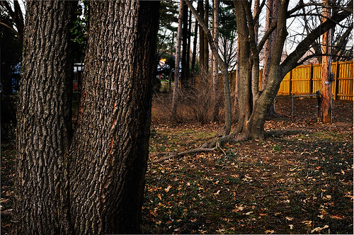
Trees Watch Trees

Late this afternoon I went out into my backyard with the express intent of harvesting images for use in Photoshop compositing. While I sometimes have problems in images capturing a full range of intensities, I am more often frustrated by focus problems. Even with the small sensor and relatively small apertures, I often which that I had more real front to back focus.

In this image I combined an image with the foreground trunks in sharp focus with one that had the rear trees sharp. As it turned out, I used the image with the foreground in focus and painted in the trees in the back along with the fence behind. Like a high dynamic range photo, it creates a bit of a “hyper-real” impression because photos usually lack this kind of selective focus. I hope it helps guide the eye back from left to right and front to back through the image space, landing on the nicely lit fence.

I’m building a small portfolio of these tree images, but I’m still exploring the possibilities in their arrangements and patterns.

Vincent Versace’s Flickr Group

The Three at the Side of the Road

Great news for those who have been learning digital methods from Vincent Versace’s “Welcome to Oz”. There’s now a Flickr group dedicated to the book. Vincent is participating a bit and left a very nice comment on one of my recent images:

The Sky Reflected on Flickr – Photo Sharing!: “Nice use of form and shape. Good gesture too. The only thing I’d say to consider is toning down the hot spot that rides the top edge on the right. if that were pulled down just a bit, the wonderful texture and use of light and contrast of the center leaf would stand out even more. There are several ways to do this. If you’re interested in how I would suggest to do this please send me an e-mail. But this is a really nice image.”

This image was captured last night during a walk around the neighborhood in late afternoon. It was taken in the grove of trees right across the street from my house. As I’ve worked through the techniques in Oz, I see that many of the manipulations across time and space that are done depend on the camera being on a tripod. While I sometimes use one, I prefer a more spontaneous way of working with a handheld camera. It may be worth some experimentation if I can correct some of the exposure and focusing problems that I run into with my current style.